The Signs of the Time: A Closer Look at Political Signage
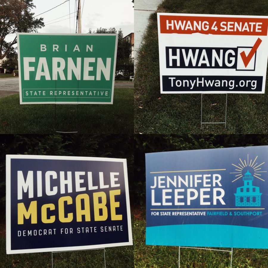
Local election signage: Michelle McCabe and Tony Hwang are running for the 28th Senate district, and Jennifer Leeper and Brian Farnen are running for the 132nd House district.
Designing a political sign sounds like an easy task, but it is more complicated than aesthetics. Background color, text, and graphics, are all tools that can be used to not only catch someone’s eye, but also communicate something about a campaign.
To find out more, I contacted three current local candidates about their signs, which you can see around Fairfield. Why do they look the way they do?
Let’s start with Brian Farnen. He is the incumbent state representative for the 132nd district seeking re-election, and his sign has white text over a green background. He chose green for the background color because it stood out from the other political signs, and he tied it into his Irish heritage. “I thought everyone was using the same colors so I wanted to break out with a chance to differentiate,” he said. Additionally, green stands for clean energy, which Farnen works in, adding even more meaning to the color he chose.
Jennifer Leeper, the Democratic candidate for the 132nd House district, took a different approach on her sign, with a blue and teal background beside a graphic of the Penfield Reef lighthouse. Her goal was to make her sign feel less like a political statement and more of a representation of the community by using this unique choice of colors and images. “I think people are very disenfranchised by anything political right now,” Leeper explained, citing that as her reason for not using the traditional colors of red, white, and blue in her sign. The image of the lighthouse, an iconic part of Fairfield, gives the sign a personal feel. She goes on to say: “I hoped… I could differentiate myself as an individual and not as a traditional ‘politician.’ I decided to run because I too am dissatisfied with traditional politics and the status quo. I wanted my brand to represent a departure from that.”
Michelle McCabe’s sign is also one that you can see around here. It has a dark, navy blue background with slanted yellow and white text. McCabe, who is the Democratic candidate for the 28th Senate district, shared: “The qualities I wanted my signs to convey are that I am someone who isn’t entrenched in politics, someone who has a new voice and a fresh perspective.” The sharp contrast in colors on the sign communicate just that, while also being eye-catching to the viewer. “I wanted people to look at it and think, this is something different, but also bold and confident.” She added that the slanted text was meant to resemble a megaphone.
I also contacted Senator Tony Hwang, the incumbent for the 28th district, but he did not respond. However, we can still try to break down the design of his sign. It is much more straightforward than the others we have discussed, using only his name, website, and a few graphics. The red, white, and blue color palette are traditionally used in politics, as they come from our country’s flag. Finally, the only image, a simple checkbox next to his name, represents someone voting for him.
These four signs are all different, but they were all carefully designed to catch your attention, as the townspeople and possible voters–and tell you something about the campaign.

Campbell is the News Editor at Prospect. This is Campbell's fourth year with the Prospect staff. Campbell is also on Ludlowe's Ultimate Frisbee team!


